Luxury & Industrial Furniture
https://www.kieurope.com/
UX/UI
Creating Happy, Healthy, High Performing Working & Learning Environments
When I joined the KI Europe website rebuild project, the mission was clear, elevate a furniture company renowned for creating happy, healthy, high-performing working and learning environments into a digital leader. KI’s existing site, built on an outdated CMS, was lagging, clunky, not mobile-optimised and outpaced by competitors offering slick, interactive experiences. I started by dissecting the old platform’s shortcomings: slow load times, poor navigation and a lack of tools to showcase KI’s durable, flexible furniture range. Competitor analysis revealed they were winning with engaging product configurators and rich content that let clients build their ‘perfect product.’ I dug into KI’s audience, schools, offices and universities, mapping their need for intuitive design and practical info. Technical research focused on Episerver, our chosen CMS, exploring how it could deliver a modern, mobile-first site that aligned with KI’s legacy of smart, sustainable solutions since 1941.
Good design meets advanced engineering
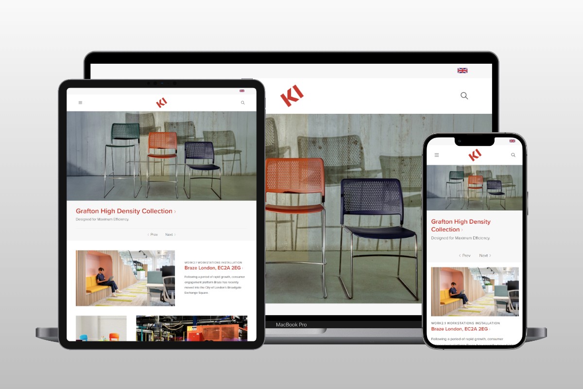
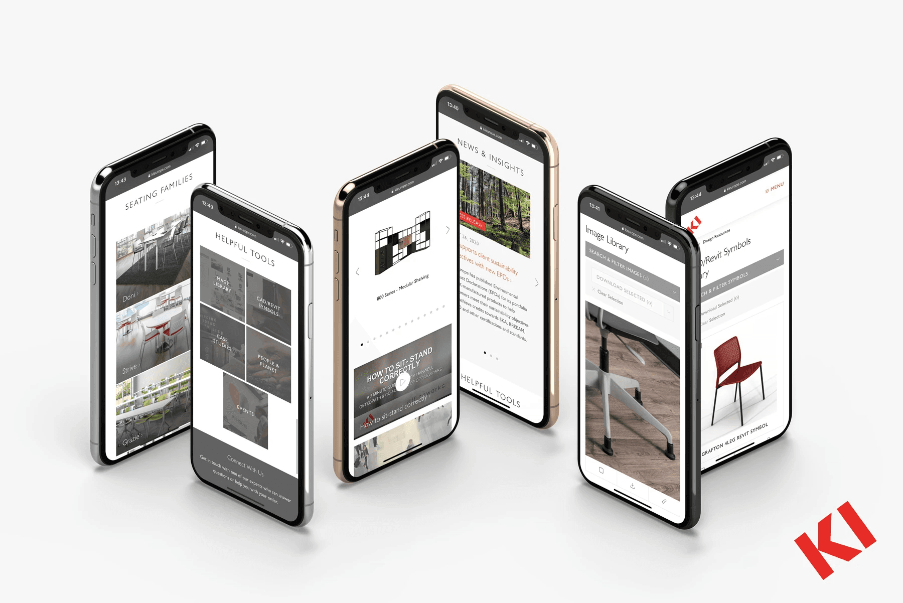
The redesign wasn’t just a facelift, it was about rethinking how KI connected with its users. I pictured a site where clients didn’t just browse but experienced KI’s ethos: good design meets advanced engineering. The old CMS choked on mobile devices and buried content in dated layouts. I envisioned a clean, interactive hub, mobile-optimised from the ground up, where navigation felt effortless and product knowledge came alive. Episerver’s flexibility inspired me to weave in dynamic tools (could we let users visualise furniture in their spaces?). Privacy wasn’t a huge concern here, but usability was king; I wrestled with balancing a modern aesthetic against the need for clear, accessible info. My backend role shaped my thinking too, importing old data and building visual pages meant ensuring every element worked seamlessly, reflecting KI’s promise of excellent value in a digital space.
Showcase for KI's diverse solutions
The rebuild hinged on bold shifts. We ditched the old CMS for Episerver, unlocking a mobile-optimised platform that felt fresh and responsive, critical for clients on the go. The new site became a showcase for KI’s diverse solutions, from ergonomic seating to integrated storage, with a clean, modern design that mirrored their sustainable ethos. Interactive tools emerged as a cornerstone, think intuitive product comparisons and visuals that let users explore KI’s offerings, edging closer to that ‘perfect product’ experience competitors nailed. I spearheaded the backend build on Episerver, migrating and updating content from the old site while crafting visual pages that popped, think crisp layouts highlighting KI’s signature collections. Navigation streamlined into a user-friendly flow, making it easy for schools or offices to find tailored solutions. The result was a site that didn’t just inform but invited engagement, positioning KI as a forward-thinking furniture leader.
Thrusting KI into the digital spotlight
The KI Europe website relaunched as a game-changer, thrusting the company into the digital spotlight. Clients now glide through a mobile-optimised experience, clean, modern and easy to navigate, raving about how it reflects KI’s 80-year legacy of innovative design. The shift to Episerver slashed load times and made content management a breeze, with updated visuals and imported data breathing new life into every page. Users linger longer, thanks to interactive elements that spark product curiosity, narrowing the gap with competitors’ experiential edge. Feedback from KI’s diverse clients, top organisations in education and workplaces, praised the intuitive flow and how it showcases flexible, high-value furniture solutions. My backend work paid off: the site’s seamless structure supports KI’s mission, proving a thoughtful UX/UI overhaul can transform a brand’s digital presence into a true extension of its craft.